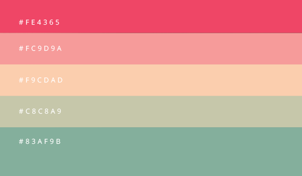
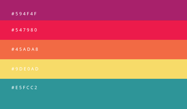
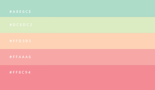
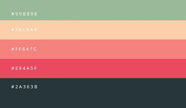
This globe would have been a dull straight ball if there were no existence of colors, only black and white, or grey shades would have been too boring. However all colors have their own significance, beauty and grace and we cannot deny their expertise and psychology.
Some of us love to use brighter color tones in our wardrobes because maybe that suit our mood and personality. Or maybe we just can relate to a particular color or color combinations. Painters, artists and designers have a lot to do with colors and hues, their entire work of art relies on using the proper color scheme. You know throwing colors on the canvas can never form a masterpiece if contrast and combinations are not appropriate or correlated.
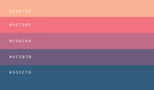
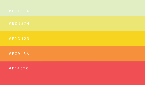
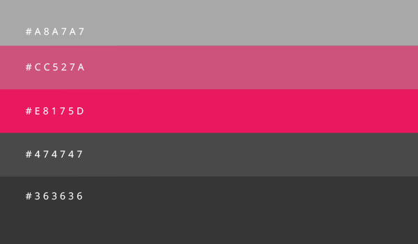
We associate certain sense and meaning behind a color or multiple colors; artists know how to make the mix & match, and how to blend various colors to get the perfect result. You know it is never a blind game, if we look around, rainbow, butterfly and even sky gives us the implications that this world is full of insignias. In flowers, in orchards in nature what we find is the magic of God who has beautifully drawn this cosmos in all shades whether dark or light. Today I am unfolding before you 8awesome color combinations for your 2016 graphic design projects.
By looking at these you will have a fair idea that what 5 color scheme can match your tasks or upcoming project. Always be prudent enough to choose what suits the stance of your project because it is not only the perspective that matters, it is also the implementation of an idea that marks the impression. Stay hooked to us because we have a lot to unfold before you.
Do give us your feedback and make us know how far you have actually been benefitted from the art and design posts that we manage to bring before you on daily basis without a break. Subscribe us to keep a check on new updates every day.
